Turning offline trust into confident online bookings
GlossnGlass is a premium bridal makeup studio and internationally certified academy in Bangalore. The business had strong offline credibility, celebrity clientele, real word-of-mouth trust, but the website didn't carry any of it. Brides and aspiring makeup artists landed on the same confusing homepage and couldn't tell whether it was a service, a school, or both.
View LiveStrong offline reputation, weak digital presence. Users couldn't assess expertise or tell service offerings apart, course outcomes were unclear, and two very different audiences, brides and aspiring artists, followed the same unclear journey.
UX Designer & Website Developer, owned both the design decisions and the technical build.
- Ran discovery research, stakeholder interviews, user conversations, competitor analysis, to find what each audience actually needed to feel confident.
- Designed separate journeys for brides (credibility-first) and academy students (certification-first) within one coherent brand.
- Built and shipped the full responsive site end-to-end, from wireframes through visual design to development.
Live in production. Bridal enquiries and booking confidence increased, course discovery improved, and form abandonment dropped.
Research surfaced that brides scan credibility first and students seek certifications first, the same content hierarchy could not serve both, which is what the redesign was built to fix.
Two audiences, one unclear homepage
GlossnGlass runs two things under one brand: a premium bridal makeup & styling service, and an internationally certified academy for aspiring makeup artists. Offline, both had real credibility, celebrity clientele, word-of-mouth trust, visible expertise. None of that was translating online. A bride landing on the homepage couldn't tell if this was a salon, a school, or both. An aspiring artist couldn't easily find course outcomes or curriculum details.
The deeper issue wasn't a visual one. It was that users couldn't assess expertise or judge service quality from the site as it stood, and the two audiences had no distinct path forward.
| Aspect | Before | After |
|---|---|---|
| Homepage architecture | Single generic homepage serving neither audience clearly | Separate, intent-matched journeys for brides and academy students |
| Credibility signals | Offline reputation and expertise not visible online | Trust-first design, portfolios, certifications, and proof surfaced early |
| Course clarity | Course outcomes and structure unclear | Curriculum, certifications, and outcomes made explicit up front |
| Build ownership | N/A, no prior structured site | Designed and developed end-to-end by one person |
Two audiences, evaluating on completely different criteria
Talking to brides and to prospective students separately, rather than assuming one persona covered both, surfaced two different decision processes hiding under one homepage. Brides didn't ask about pricing first, they scrolled looking for proof this studio could be trusted on one of the most important days of their life. Students asked almost nothing about the studio's bridal work, they wanted to know what certification they'd walk away with and whether it was recognised.
The homepage wasn't unclear because of weak copy or a generic layout, it was unclear because it was answering one audience's questions in a hierarchy the other audience didn't care about. Trust signals a bride needed were buried under academy content, and certification details a student needed competed with bridal portfolio work. Neither audience was price-anchoring first, visual proof of quality and outcomes is what moved both, just proof of different things.
Brides scan credibility first. Before pricing, before packages, brides needed to see proof that this studio was trustworthy for one of the most important days of their life.
Students seek certifications. Aspiring artists were evaluating the academy on outcomes: what certification they'd walk away with, and whether it was recognised.
Trust beats pricing in premium services. Neither audience was price-anchoring first. Visual proof of quality, real work, real results, drove confidence far more than lengthy explanations of what the service included.
Separating the journeys without splitting the brand
Given that insight, the original single homepage narrative couldn't be patched with better copy, it needed a different decision entirely: distinct, uncluttered paths for brides and students, without turning GlossnGlass into two disconnected businesses online. Three shapes were on the table.
Designing for how each audience actually decides
Every screen was built against one of the two research insights, credibility-first for brides, certification-first for students, rather than a single shared template stretched to fit both.
STARTED
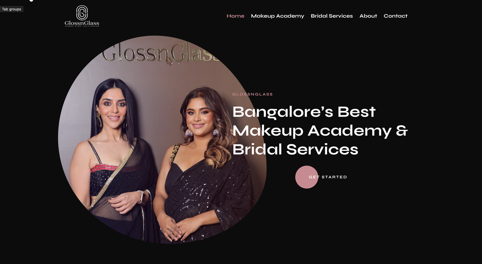
Bridal path. Leads with real work and client trust signals before any pricing or package detail, matching how brides actually evaluate a stylist for their wedding day.
Academy path. Leads with certification and curriculum clarity, because that's the first question every prospective student asks before anything else.
Component patterns, live on glossnglass.com
The shipped site runs a dark, editorial visual language, black surfaces, a dusty-rose accent, and a gold serif wordmark, built to read as premium rather than clinical. These are the actual patterns in production, not a generic template; hover any of them.
STARTED
What shipped
The redesigned site is live in production. Post-launch, bridal enquiries and booking confidence increased, session engagement went deeper, form abandonment dropped, and course discovery on the academy side improved, consistent with what the research predicted would happen once each audience got a path built for how they actually decide.
What I can and cannot claim. These directions are based on post-launch engagement and enquiry patterns the client reported back. I don't have an instrumented analytics baseline to cite exact percentages, so I've kept the claims directional rather than inventing precision that isn't there.
What I'd do differently
Set up proper analytics instrumentation before launch, not after. Without a pre-launch baseline, I can speak to direction and client-reported impact but not to precise, auditable numbers, which is a gap I'd close on day one for the next project like this.
What this design gives up on purpose Two deliberate trade-offs
Cross-selling between Bridal and Academy. Separating the two journeys means brides rarely see academy content and vice versa. There's a real cross-sell opportunity, brides who later train, students who later book, that this architecture doesn't actively pursue.
A single unified brand story above the split. Routing visitors early keeps each path uncluttered, but it means the site never tells one unified GlossnGlass story before branching, the wordmark and dark visual language carry that weight on their own.