Turning an emotional heritage product into a trustworthy digital experience
House of Ishaani is an ethnic fashion brand specializing in handwoven Banarasi sarees, entering digital retail with no existing UX structure and no established online trust signals for a category where authenticity is everything.
View LiveCustomers struggled to understand weave types and distinguish similar-looking sarees, had authenticity concerns about handwoven claims, and hit decision paralysis while browsing, on a site with no prior UX structure to build from.
UX Designer & Website Developer, responsible for both strategic design decisions and the technical Shopify build.
- Ran discovery through stakeholder interviews, customer conversations, competitor analysis, and session replay behavior mapping.
- Replaced the flat category list with a three-dimensional taxonomy, occasion, weave, and material, matching how gift, style, and material buyers actually shop.
- Designed and developed the full Shopify experience, including authenticity signals like weaving technique stories and craftsmanship badges.
Increased product engagement and scroll depth, more confident add-to-cart actions, and reduced browsing fatigue through clearer categorization.
Research showed customers frequently zoom images and read weaving techniques carefully before comparing multiple sarees, emotion and trust, not visual appeal alone, drive luxury textile purchases.
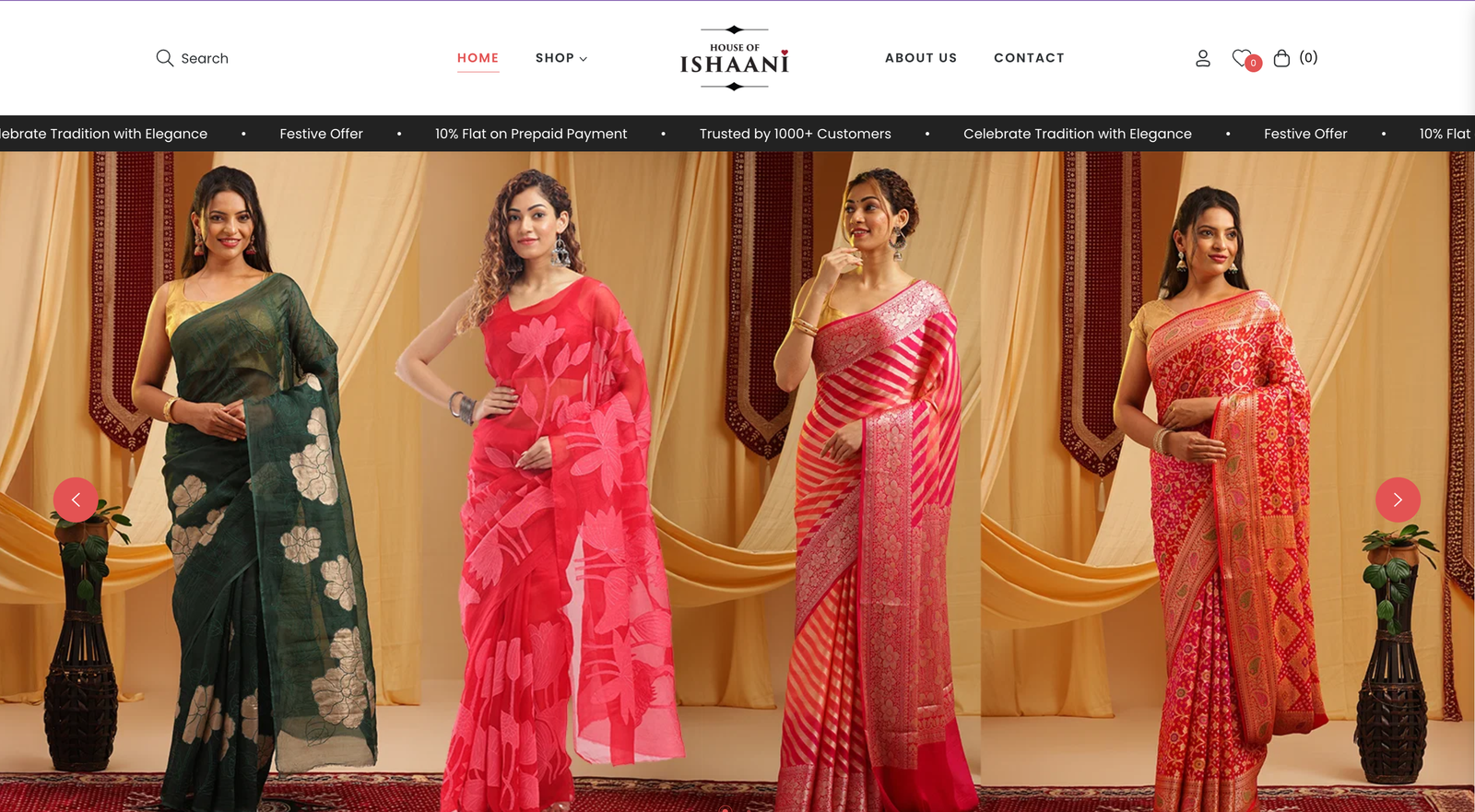
No prior structure, a complex catalogue, and a trust gap
Banarasi sarees are a heritage, high-value product where authenticity claims matter enormously. The brand had no prior UX structure to build from, a catalogue that looked repetitive to an untrained eye, and no digital trust signals to reassure buyers that handwoven claims were genuine.
Evidence: stakeholder interviews, customer conversations, competitor analysis, and session replay behavior mappingSession replays were the most useful input, they showed people behaving nothing like typical fashion-site browsing. Visitors zoomed into weave close-ups repeatedly, opened and reread the same technique descriptions, and toggled back and forth between two or three sarees before either buying or leaving without adding anything to cart. Customer conversations confirmed why: on a flat category list, sarees that were structurally different, gifting-occasion pieces, style-led pieces, fabric-led pieces, all looked interchangeable, so buyers fell back on comparing images pixel by pixel to feel sure they weren't missing something.
The catalogue wasn't failing on taste, it was failing on trust. Customers weren't undecided about which saree looked best, they were unable to confirm they understood what made each one different, and in a category where a wrong purchase is expensive and hard to return, that uncertainty was enough to stall the decision entirely.
Structuring the catalogue around three different shoppers, not one
The original flat category list treated every visitor as a generic browser. But the interviews surfaced three distinct shopper types, gift buyers starting from an occasion, style buyers starting from an aesthetic, material buyers starting from a fabric, each asking a different first question the old structure couldn't answer.
More images would have fed the exact zoom-and-compare loop the session replays showed, without addressing why buyers needed to verify so carefully in the first place.
Lets each of the three shopper types start from the question they actually arrived with, and pairs that structure with visible authenticity signals so trust doesn't rely on image-zooming alone.
Three distinct shopper types. Gift buyers, style buyers, and material buyers each start from a different question, occasion, aesthetic, or fabric, and a single flat category list served none of them well.
Customers verify before they trust. Session behavior showed frequent image zooming and careful reading of weaving technique descriptions before comparing across multiple sarees, so weaving-technique stories and craftsmanship badges were added directly where that verification was already happening.
Guided navigation reduces fatigue. When products look visually similar, structure, not just imagery, is what lets a buyer feel confident they've compared the right options.
Component patterns, live on houseofishaani.com
A three-dimensional taxonomy only reduces fatigue if the filters and authenticity signals are visible at a glance, not buried in a product description. The visual system leans into festive maroon and gold, a marquee announcement bar, gold CTAs, and taxonomy chips that let a buyer filter by occasion, weave, or material simultaneously. Hover any pattern below.
What shipped
A live Shopify storefront with a three-dimensional taxonomy that supports catalogue growth without structural rework, built-in authenticity signaling, and a navigation model matching how gift, style, and material buyers actually search. The zoom-and-compare loop the session replays flagged didn't disappear, but it now happens alongside visible craftsmanship signals instead of as the only way to feel sure about a purchase.
What I can and cannot claim. The engagement and fatigue directions reflect post-launch patterns the client reported to me, not numbers from an instrumented pre-launch baseline I ran myself, so I've kept them directional rather than quoting specific percentages. What I can point to with more confidence is structural: a taxonomy built from three named shopper types instead of one generic list, and authenticity signals placed exactly where the session replays showed customers already looking for reassurance.