Turning clinical expertise into a website people actually trust
Nutriahaar is a nutrition and dietetics practice led by a senior clinical dietitian with real hospital experience. The clinical skill was never in question. The website was. Visitors couldn't tell what plan to pick, corporate clients couldn't find what they needed, and bookings dropped off before they were confirmed.
View LiveUsers struggled to understand nutrition terminology and pick the right plan. Booking felt unclear enough that people dropped off before confirming, and corporate wellness services were almost invisible on the site.
UX Designer and Website Developer, responsible for the full responsive site from research through launch.
- Ran discovery through stakeholder interviews, competitor analysis, and conversations with real prospective clients.
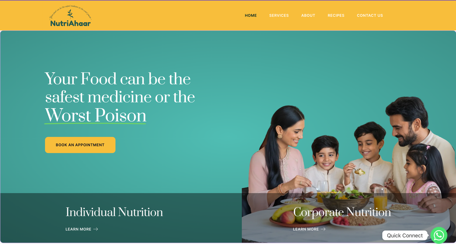
- Rebuilt the information architecture so individual and corporate nutrition services each got a clear, separate path.
- Simplified plan selection and the booking flow so a first-time visitor could understand what to pick without calling to ask.
12+ individual appointments booked in the first month, and 4+ corporate inquiries generated from a page that had previously gone almost unnoticed.
The practice's own expertise didn't change. What changed was whether a visitor could find the right plan and trust it enough to book, and the booking numbers moved because of that.
Real expertise, hidden behind a confusing website
Nutriahaar is led by a senior dietitian with real clinical credibility, including hospital-level experience. None of that was the problem. The site simply didn't help a visitor act on it. Nutrition terms went unexplained, individual and corporate services blurred together, and the path from landing on the site to actually booking a session wasn't clear enough to follow through on.
Evidence: stakeholder interviews, competitor analysis, conversations with prospective clientsTalking to people who'd actually considered booking, not just the practice's existing clients, surfaced why the site wasn't converting. Individual clients described skimming past corporate-sounding language looking for a personal plan, while the one or two corporate leads who'd tried to find a team wellness program said they gave up because it wasn't clear the practice even offered one. Nobody mentioned distrusting the dietitian's expertise, that was never the objection.
The credibility problem people assumed didn't exist, the clarity problem did. Individual and corporate visitors were being shown the same undifferentiated page and each was quietly filtering out content meant for the other, which meant real corporate demand was going unseen simply because it never found its own path.
| Aspect | Before | After |
|---|---|---|
| Service clarity | Individual and corporate services blended together | Two distinct paths, each with its own entry point |
| Booking flow | Unclear steps, people dropped off before confirming | Simplified, guided booking flow |
| Corporate visibility | Almost invisible on the site | Dedicated corporate nutrition section |
Splitting the homepage instead of rewriting its copy
A softer fix, better labeling, clearer headings on the same shared page, would have still asked two audiences with different questions to filter through content meant for someone else. Given what the interviews surfaced, we split the entry point itself instead.
Still requires each visitor to filter past content meant for the other audience, the exact behavior interviews showed was already causing corporate demand to go unnoticed.
Matches the two distinct questions visitors actually arrive with, and gives corporate intent a visible home instead of competing for space on a page built around individual plans.
Two audiences, two paths. Individual clients want a personal plan. Corporate clients want a program for their team. Splitting the homepage around that difference removed the confusion immediately.
Plain language over clinical terms. Nutrition jargon that made sense to a dietitian didn't make sense to a first-time visitor deciding whether to book.
Booking had to feel low-risk. A single clear "Book an Appointment" action, instead of a multi-step form that made people second-guess themselves.
Component patterns, live on nutriahaar.com
Splitting the paths only works if each one still feels like the same trustworthy practice, not two unrelated sites bolted together. The visual system uses a warm teal and yellow palette that feels approachable rather than sterile, matching a practice that wants to feel like a partner, not a clinic. Hover any pattern below.
What shipped
A live site that gives individual and corporate visitors separate, clear paths, with a booking flow simple enough that people actually finish it. In the first month after launch, that translated into 12+ individual appointments and 4+ corporate inquiries, numbers the client hadn't seen from the site before.
What I can and cannot claim. The dietitian's clinical expertise didn't change between the old site and the new one, so the booking and inquiry numbers above are attributable to what visitors could find and trust, not to any change in the service itself. These are client-reported figures for the first month, not an independently audited long-term baseline.