Building comfort and discretion into a premium care brand
Vinyaara is a premium women's care brand, menstrual pads and panty liners positioned around comfort and protection, for women dissatisfied with conventional options. The brand needed a digital storefront that felt as considered and premium as the product itself, in a category most sites treat clinically.
View LiveA premium personal-care product needed a storefront that matched its positioning, most sites in this category default to clinical, transactional layouts that undersell a genuinely premium product.
UX Designer & Website Developer, owned both design and technical build for the full responsive site.
- Designed a calming, editorial visual identity, soft cream and plum, natural photography, that reframes the category as wellness rather than clinical necessity.
- Structured the shop around real purchase patterns: trial kits for first-time buyers, monthly and value packs for repeat customers.
- Built a "Care Journal" content section addressing menstrual health topics, positioning the brand as a resource, not just a retailer.
A live D2C storefront that carries the brand's "comfort should never be something you have to compromise" positioning through every screen, not just the product copy.
The Trial Experience kit exists specifically because first-time buyers in this category are risk-averse, a low-commitment entry point was a deliberate conversion decision, not just a product tier.
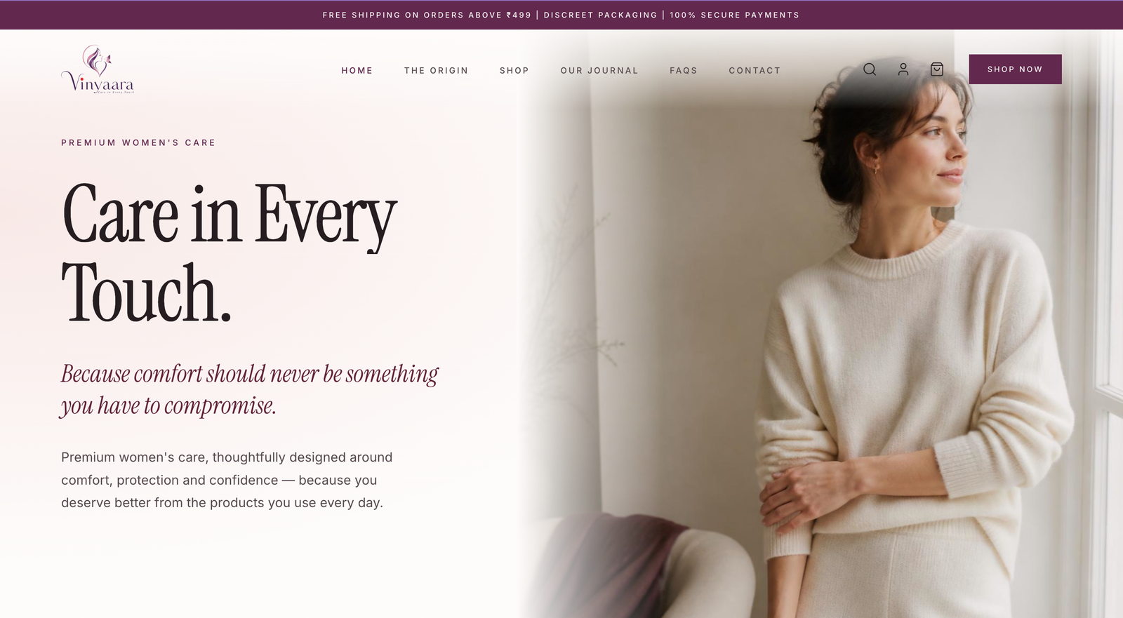
A premium product needed a premium first impression
Vinyaara's product addresses real complaints with conventional menstrual products, irritation, restricted movement, poor breathability, with ultra-thin, rash-free materials and odor-locking technology. But a strong product doesn't sell itself digitally in a category where most competitors default to purely functional, clinical storefronts. The brand needed the site itself to communicate "premium" before a visitor reads a single spec.
Evidence: founder and stakeholder discovery sessions, competitor storefront auditSitting with the founding team and walking through how competitors present the same category surfaced a consistent pattern: nearly every storefront defaulted to clinical, spec-forward layouts, white backgrounds, packaging shots, feature bullet points. That's a safe choice for a commodity product, but the founders were explicit that Vinyaara wasn't trying to win on being the cheapest or most clinical option, it was trying to win on comfort and discretion, qualities a clinical layout actively works against.
The category's visual convention wasn't neutral, it was quietly telling customers this is a medical necessity to tolerate, not a product to feel good about buying. If the site looked like every competitor's, the premium positioning would have to be argued for in copy instead of felt immediately, and by the time a visitor reads that copy, the clinical layout has already set the wrong expectation.
Choosing warmth over the category's safe default
A proven pattern for the category, but it would reinforce the exact perception the product itself was designed to move away from.
Lets the site carry the same "comfort should never be something you have to compromise" positioning the product already claims, before a visitor reads a single spec.
The same discovery sessions surfaced a second, more specific concern from the founders: first-time buyers in this category are risk-averse about committing to a full pack from a brand they haven't tried. A full-size-only shop, the category default, would ask for that commitment upfront. We built a Trial Experience kit as the primary first-purchase path instead, a deliberate conversion decision, not just a smaller product tier.
| Aspect | Category default | Vinyaara approach |
|---|---|---|
| Visual tone | Clinical, purely functional | Editorial, calming cream & plum palette |
| First purchase | Full-size packs only | Trial Experience kit for low-commitment entry |
| Brand content | Product pages only | Care Journal, educational, not just transactional |
Component patterns, live on website.vinyaara.com
Editorial and calming only works if it's consistent everywhere, one clinical-looking product card would undercut the whole positioning. The visual system uses a soft cream ground, a deep plum accent, and an italic serif for editorial moments, deliberately closer to a lifestyle brand than a pharmacy shelf. Hover any pattern below.
What shipped
A full, live D2C storefront, homepage, shop, Care Journal, and origin story, that carries a premium, editorial identity through every screen rather than defaulting to the category's clinical norm. The founders now have a first-purchase path built around the actual objection buyers raise, not just a smaller SKU.
What I can and cannot claim. As a recently launched site, I don't yet have a long-term performance baseline to cite, the claims above describe what was designed and shipped, not measured conversion outcomes.